

Decoding the Symbolism in the Tomb Raider x Coca-Cola Advertisements
Where Two Iconic Brands Meet — An Introduction to the Campaign
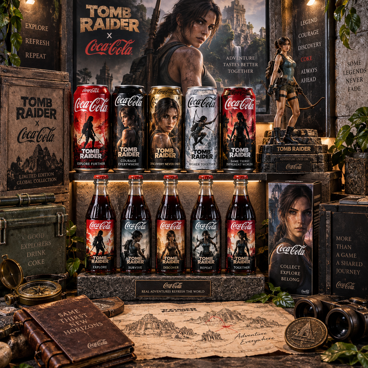
The Tomb Raider x Coca-Cola promotional campaign is one of the more visually ambitious gaming crossovers in recent memory, pairing one of the world's most recognizable soft drink brands with one of gaming's most enduring action heroines. On the surface, it reads as a co-branding exercise. Look closer, and there's a layered piece of visual storytelling that rewards the kind of attention Tomb Raider fans already bring to the franchise.
Collaborations between gaming IP and mainstream consumer brands have grown dramatically over the past decade, but this one stands out. Both Coca-Cola and the Tomb Raider franchise carry decades of cultural weight. Coca-Cola is practically a synonym for refreshment and reward. Lara Croft is shorthand for adventure, grit, and self-determination. The creative direction of this campaign seems acutely aware of that shared symbolic territory — and builds its imagery directly on it.
For fans of the franchise, the campaign offers something more than a bottle with a logo slapped on it. It's an invitation to read Lara Croft's world through a different lens, and to see how two distinct brand identities can reinforce each other when the alignment is done thoughtfully.
Lara Croft as a Symbol — What She Represents in the Ad Imagery
Lara Croft is not just a game character in this campaign — she functions as a cultural archetype, and the ad creative leans into that deliberately. Her presence in the imagery communicates independence, physical resilience, and a particular kind of curiosity that drives people toward the unknown rather than away from it.
Since her debut in 1996, Lara has evolved from a stylized action figure into a more grounded, psychologically complex protagonist. The promotional material appears to draw from this more modern interpretation — a Lara who earns her moments of triumph through persistence, not luck. That framing matters symbolically. It positions the Coca-Cola product not as a passive refreshment but as something that belongs in the context of effort and reward.
Her posture in the ads is worth examining. Where many celebrity or character endorsements place the subject in a static, product-forward pose, Lara tends to appear mid-motion or in environments that imply recent exertion. She's arrived somewhere. She's done something. The Coca-Cola moment, then, reads as a earned pause — which is a far more emotionally resonant symbolic frame than simple product placement.
This is smart use of character symbolism. Lara's identity as a survivor and explorer transfers meaning onto the brand interaction itself.
Coca-Cola's Visual Language and How It Intersects with Tomb Raider's Aesthetic
Coca-Cola's design language is one of the most studied in advertising history — the contour bottle, the red and white palette, the flowing script. These aren't just aesthetic choices; they're loaded with decades of emotional association. The campaign's creative challenge was integrating that language into Tomb Raider's world without either brand losing its identity.
Tomb Raider's visual aesthetic is built on tension between ancient and modern, between decay and vitality. Stone temples, overgrown ruins, torchlight, mud-streaked survival gear — these are the textures of the franchise. Coca-Cola's visual language, by contrast, is clean, energetic, and optimistic. The intersection of these two aesthetics shouldn't work on paper, but the campaign finds its footing by treating the Coca-Cola red as a source of warmth and life within darker, more weathered environments.
Think of it as a visual metaphor: the familiar red of the bottle or can becomes a beacon in an otherwise muted, earth-toned frame. It signals civilization, comfort, and momentary relief — the exact emotional register Coca-Cola has always occupied, now recontextualized within a survival narrative.
The brand's iconic curves also echo something in Tomb Raider's environmental design. Ancient architecture is rarely angular — it's worn smooth by time, full of arches and rounded chambers. There's a subtle visual rhyme between Coca-Cola's contour silhouette and the organic shapes of the ruins Lara inhabits. Whether intentional or not, it creates a sense of visual coherence that makes the pairing feel less jarring than it might otherwise.
The Role of Color, Light, and Environment in the Ad Symbolism
Color and lighting do the heaviest symbolic lifting in this campaign. The dominant palette — red against earth tones, warm light against shadow — creates a visual grammar that speaks to both brands simultaneously.
Red, in Coca-Cola's context, carries associations with energy, passion, and celebration. In Tomb Raider's world, red more often signals danger, urgency, or fire. The campaign sits at the intersection of these two readings. The red of the Coca-Cola branding doesn't feel out of place in a torchlit ruin because fire and warmth are already part of that world's visual vocabulary. The color bridges the two brand universes rather than clashing with either.
Gold plays a secondary but meaningful role. Tomb Raider has always used gold as shorthand for ancient treasure, discovery, and the payoff of a difficult journey. When gold appears alongside Coca-Cola's red in the campaign imagery, it reinforces the idea that the product belongs in a moment of achievement — the treasure found, the ruin explored, the challenge survived.
The environmental choices in the creative direction also carry weight. Ancient settings — temples, caves, overgrown ruins — position the campaign outside of everyday consumer life. This is deliberate. By removing Coca-Cola from its usual context (a gas station, a restaurant, a refrigerator), the campaign elevates the act of drinking it into something more mythic. You're not grabbing a soda. You're taking a moment of restoration in the middle of an adventure.
Themes of Adventure, Refreshment, and Reward — A Shared Narrative
The deepest symbolic layer of this campaign is the narrative it constructs around a single shared theme: the reward that follows effort. Both Coca-Cola and the Tomb Raider franchise have built their emotional appeal on this structure, and the campaign makes that connection explicit.
Coca-Cola's advertising has long used the language of refreshment as release — the cold drink after physical exertion, the shared moment after a long day. Tomb Raider's narrative structure is almost entirely built on cycles of hardship and breakthrough. Lara faces an obstacle, overcomes it, and earns a moment of relief before the next challenge begins. These two narrative rhythms are nearly identical, which makes the brand alignment feel organic rather than forced.
The concept of discovery as reward is another shared thread. Lara's world is defined by uncovering what's hidden — ancient secrets, lost civilizations, forgotten truths. Coca-Cola's brand mythology has always carried a similar undercurrent: the idea that within the familiar, there's something worth savoring, something that reveals itself in the right moment. Both brands invite their audiences to find value in the act of paying attention.
This thematic overlap is what separates a symbolically rich co-branding campaign from a purely transactional one. When the emotional logic of both brands points in the same direction, the collaboration tells a coherent story rather than simply displaying two logos side by side.
What the Campaign Says About Modern Gaming x Brand Collaborations
The Tomb Raider x Coca-Cola campaign reflects a broader shift in how gaming IP is used in mainstream marketing. Gaming culture has moved from a niche subculture into one of the dominant forces in global entertainment, and brands like Coca-Cola are increasingly treating game characters as cultural shorthand with the same resonance as film stars or athletes.
What's notable here is the level of symbolic literacy the campaign assumes from its audience. It doesn't explain who Lara Croft is. It doesn't contextualize the Tomb Raider world. It simply places the Coca-Cola brand within that world and trusts that the audience will bring their own understanding of what Lara represents. That's a significant shift from earlier gaming brand deals, which often felt obligated to translate the game's appeal for a general audience.
This approach treats gaming fans as a primary audience rather than a secondary one — which is both a smart marketing decision and a cultural acknowledgment. Lara Croft's symbolism is legible enough now to carry a campaign without explanation. That's the mark of a franchise that has genuinely crossed into mainstream cultural consciousness.
It also signals where co-branding is heading. The most effective gaming crossovers don't just license a character — they engage with what that character means, and build creative around that meaning. The Tomb Raider x Coca-Cola campaign does exactly that.
Why the Symbolism Works — Final Takeaways for Fans and Marketers Alike
The campaign succeeds because it doesn't force the two brands together — it finds the genuine symbolic overlap between them and builds its creative on that foundation. Lara Croft's identity as an explorer who earns her moments of rest maps cleanly onto Coca-Cola's long-standing language of refreshment as reward. The visual choices — color, light, environment — reinforce that alignment without either brand losing its own identity.
For Tomb Raider fans, the campaign feels respectful of Lara's character rather than exploitative of it. She's not reduced to a prop holding a bottle. She remains the protagonist of her own story, and the Coca-Cola moment fits within that story's emotional logic. That's the difference between a character endorsement and a character-driven collaboration.
For anyone interested in how brands use gaming culture, this campaign is worth studying. It demonstrates that the most resonant co-branding doesn't just borrow a character's visual likeness — it borrows their symbolic meaning. And when that meaning aligns with your brand's own story, the result is advertising that feels less like advertising and more like an extension of a world people already care about.
Frequently Asked Questions
What is the Tomb Raider x Coca-Cola collaboration about?
The collaboration is a co-branded promotional campaign pairing the Tomb Raider gaming franchise with Coca-Cola. It uses Lara Croft's character and the franchise's adventure aesthetic to create advertising that positions Coca-Cola within a narrative of exploration, effort, and reward.
What does Lara Croft symbolize in the Coca-Cola advertisements?
Lara Croft symbolizes resilience, independence, and the idea that reward follows effort. In the campaign imagery, her presence reframes the Coca-Cola moment as something earned — a pause in the middle of an adventure rather than a passive consumer act.
How does Coca-Cola's branding align with the Tomb Raider theme?
Both brands share a core narrative structure built around perseverance and reward. Coca-Cola's advertising language of refreshment-as-release maps directly onto Tomb Raider's gameplay rhythm of hardship followed by breakthrough. The red and gold color palette also bridges both brand identities visually.
What visual symbols are most prominent in the campaign's creative?
The most prominent visual symbols include Coca-Cola's signature red used as warmth and vitality within dark, ancient environments; gold as a symbol of discovery and achievement; and Lara's physical posture suggesting recent exertion rather than static endorsement.
Is this campaign connected to a new Tomb Raider film or game release?
Co-branded campaigns of this scale are typically timed to coincide with a major release or entertainment event tied to the IP. While specific release details depend on the current promotional context, campaigns like this one generally serve as promotional support for new Tomb Raider content — whether a game, film, or streaming project.